
Read the Opening Without Zooming
Check the headline, the service explanation and the first button. Text should be comfortable to read with enough space around it. Watch for words that spill off the screen, photos that crop out the important part and decorations that take over the whole first screen.
Use a real phone when you can. A desktop preview gets you close, and holding the phone in one hand and tapping with your thumb shows you the rest.
Try the Menu and the Important Buttons
Open and close the menu. Follow a service link. Tap the phone number. Make sure buttons have clear labels and enough room between them that a thumb hits the right one.
See what happens when the menu opens over the page. The visitor should be able to close it and get right back to what they were reading.
The Black Bird Loaded in Less Than Half the Time
The Black Bird’s website carries a hardware store’s worth of departments, weekly sales and event pages. When we tuned its pages for speed, page weight dropped by more than two thirds and the main content appeared on a phone in less than half the time.
Before-and-after lab runs recorded in the September 10, 2026 work log. Page weight fell from 1,715 KB to 528 KB. Laboratory scores can change from one test to the next.
Same store, faster front door
Shoppers now see the weekly sales circular and the departments they came for in about three and a half seconds on a phone.
See The Black Bird project →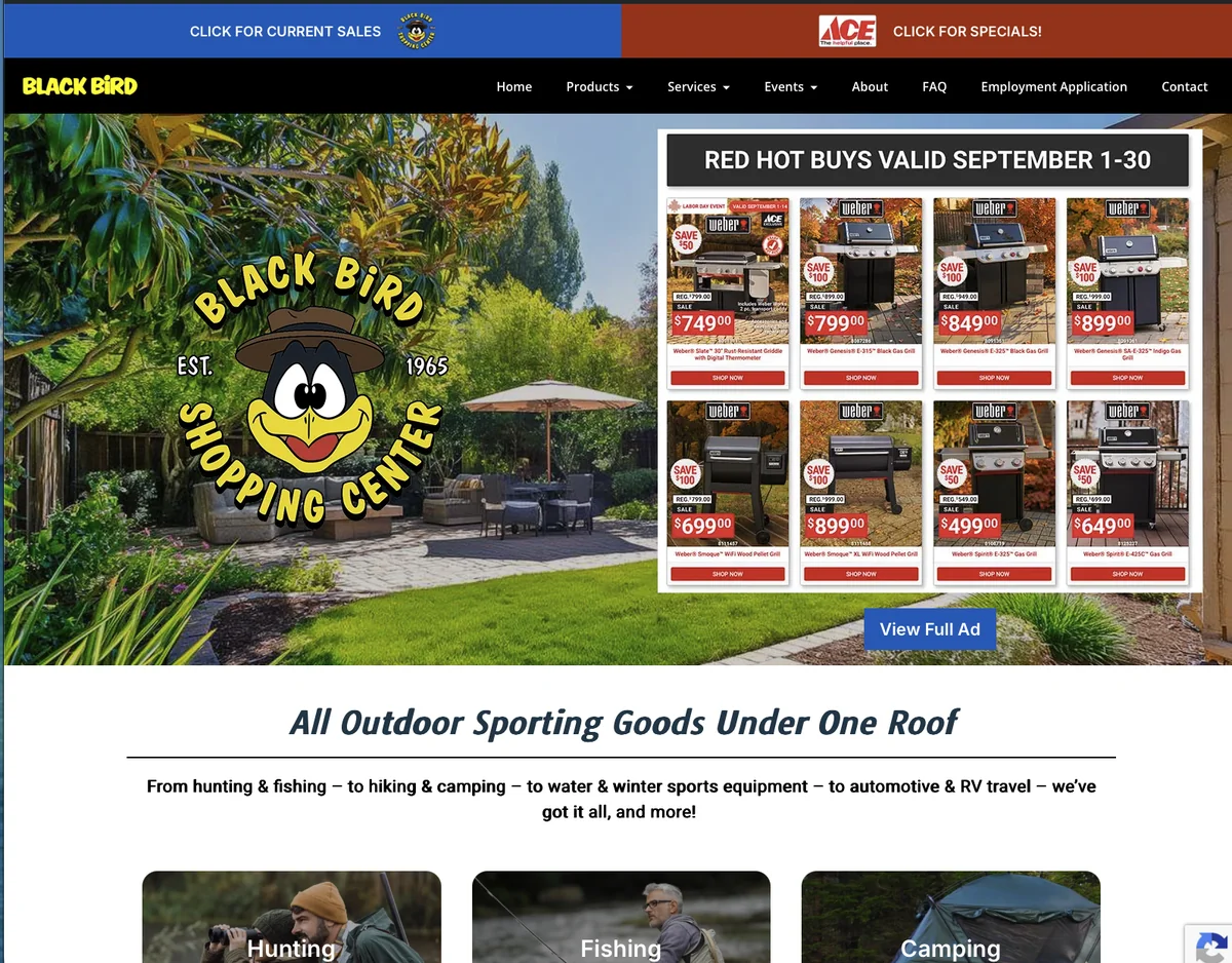
Fill Out the Form
Send a realistic test inquiry. Look for the right keyboard on the email and phone fields, clear labels and helpful error messages. Then confirm that the inquiry actually arrived in your inbox or system, beyond the “thank you” message on screen.
Label your test clearly so nobody mistakes it for a real customer.
Look at Exits in Context
Someone who leaves right after finding your phone number may have gotten exactly what they came for. It is like a customer who walks in, grabs a business card and heads out to call you from the truck. Someone who gives up on a broken form is a different story. Look at your analytics next to how the page actually behaves and what inquiries came in. An exit rate alone can’t tell you why someone left.
What Fast Looks Like on a Phone
These are Google PageSpeed Insights results for two websites we built. Russco Enterprises is an excavation company in Douglas County. Oregon RV Outlet is an RV dealership in Grants Pass with a photo-heavy inventory.
Russco Enterprises · Mobile
Google PageSpeed Insights, August 2, 2026
Oregon RV Outlet · Mobile
Google PageSpeed Insights, September 11, 2026
Individual homepage laboratory tests; scores can change between runs. Both sites scored 100 for desktop performance. See the Russco project · See the Oregon RV Outlet project

I run Good Creations in Grants Pass. I work directly with business owners on website design, content, and search. My work includes service writing, inventory websites, and custom publishing tools.
Meet Bob