- Layout
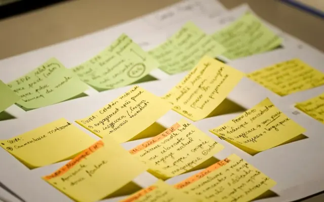
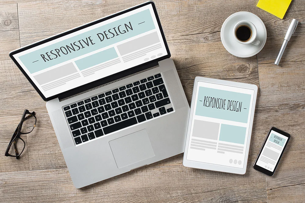
Layout is how the content is organized and presented on the page. A good layout guides the eye through the page in a clear order, is easy to navigate, and adapts to every screen size.
Organize the page so visitors find what they are looking for quickly. Clear headings, subheadings and sections break the content into easy pieces. Keep the layout consistent from page to page, so visitors always know where to look.
Width matters too. We usually design websites 1,280 pixels wide and adjust from there based on how much content the page needs.
When a page needs several columns of information, the standard 1,280 pixels can feel cramped, so we give it more room.
You have only a few seconds to tell a visitor who you are, what you do and what you want them to do next. Your layout decides how quickly they get that message.
- Color
Color shapes how visitors feel about your website. A good color scheme stays consistent across the site, reflects your brand and shows visitors what matters most on each page. Color also sets the mood.
Here is what different colors tend to make people feel:
Red:
Red creates urgency and excitement, and people associate it with passion, love and energy. In web design it often goes on call-to-action buttons, because it grabs attention and encourages action.
Orange:
Orange feels warm, energetic and playful, and people connect it with creativity, adventure and optimism. Designers use it to draw attention to important information.
Yellow:
Yellow is bright and cheerful, and people connect it with sunshine, warmth and friendliness. It makes a website feel welcoming. It is also the first color your eye processes, so use it sparingly.
Green:
Green feels calm and refreshing, and people connect it with nature, growth and prosperity. It works well for businesses with a relaxing or environmental message.
Blue:
Blue is cool and calming, and people connect it with the sky and the ocean. It is the color of security and dependability, which is why banks love it.
Purple:
Purple feels regal, luxurious and creative, and people connect it with royalty.
Black:
Black feels sophisticated and authoritative, and people connect it with luxury, elegance and formality.
White:
White feels clean and simple, and it gives a website a minimal, uncluttered look.
When you choose a color scheme, think about the purpose of your website and the feeling you want visitors to have. Warm colors like red and orange create urgency, and cool colors like blue and green calm people down. Make sure there is strong contrast between your text and background, so everything is easy to read.
Meade Construction Shows the Work Before the First Meeting
Ross and Emily Meade build custom homes. Their website puts each finished project in its own gallery with the homeowner’s review, so a prospective client can see the quality of the work before they call.
Screenshots captured September 17, 2026.
The portfolio does the selling
Every finished home becomes a page a future client can browse before the first meeting.
See the Meade Construction & Design project →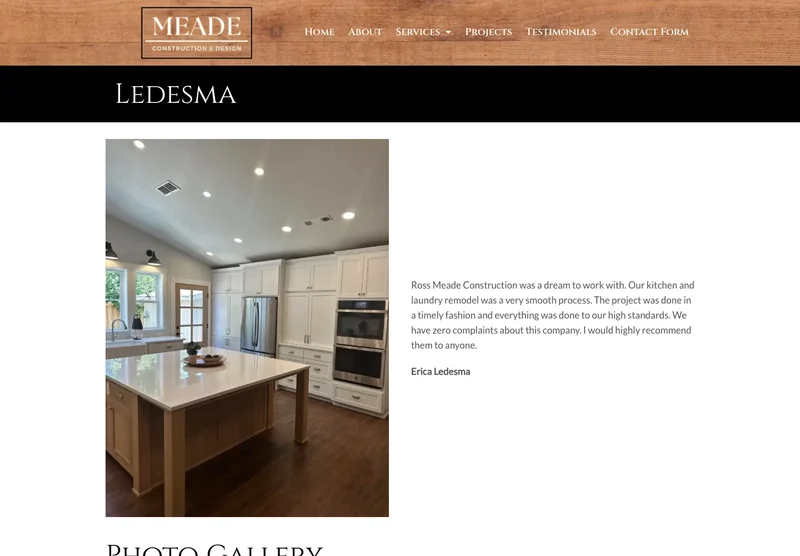
- Typography
Typography is the choice of fonts and sizes on your website. Good typography makes the site easier to read and shows visitors what is most important. Keep it consistent across the site and readable on every device.
Choose a comfortable text size and a font style that suits your business and your brand. Sans-serif fonts are easy to read on screens. Stick to two or three font styles, so the site looks consistent.
- Images
Images convey information quickly and create an emotional connection with your visitors. Use high-quality photos that are relevant to the content and sized for the web.
Choose images that fit the page and your brand, and compress them so they load quickly. Images also break up long stretches of text and make a page more inviting.
If you don’t have your own images, we can provide stock images free of charge.
- Navigation
Navigation guides visitors through your website and helps them find what they came for. Good navigation is easy to use, with clear labels and a logical order.
Put your navigation where people expect it, at the top or side of the page, with plain labels, and keep it the same on every page. Make sure it works just as well on a phone.
- White Space
White space, also called negative space, is the empty space between the elements on a page. It makes the page easier to read, draws attention to what matters, and gives the design balance.
White space is the element people overlook most. A cluttered, busy page overwhelms visitors and sends them away. A page with room to breathe feels calm and clear.
Putting the Six Elements Together
Layout, color, typography, images, navigation and white space work together. Get them right and your website is attractive, easy to use and effective at bringing in business.
Whether you are building a site for a local service business, a store or a blog, these six elements are the foundation everything else stands on. If you would like help with yours, call or text me at (541) 226-8087.
What Fast Looks Like on a Phone
These are Google PageSpeed Insights results for two websites we built. Russco Enterprises is an excavation company in Douglas County. Oregon RV Outlet is an RV dealership in Grants Pass with a photo-heavy inventory.
Russco Enterprises · Mobile
Google PageSpeed Insights, August 2, 2026
Oregon RV Outlet · Mobile
Google PageSpeed Insights, September 11, 2026
Individual homepage laboratory tests; scores can change between runs. Both sites scored 100 for desktop performance. See the Russco project · See the Oregon RV Outlet project

I run Good Creations in Grants Pass. I work directly with business owners on website design, content, and search. My work includes service writing, inventory websites, and custom publishing tools.
Meet Bob