1. Quality Content
Visitors come to your website for the content. It informs them, answers their questions and gives them a reason to act, so quality content comes first in effective website design.
Quality content is relevant, useful and original. It matches the purpose and tone of your website, speaks to the needs of your audience, and is well written and easy to scan.
To create quality content:
- Research the words your customers search for and use them naturally in your pages
- Break up long text with headings, bullet points, images and video so it is easy to scan
- Write in plain language, and proofread
- Provide accurate and up-to-date information and cite credible sources when necessary
- End every page with a clear call to action that tells visitors what to do next
Meade Construction Shows the Work Before the First Meeting
Ross and Emily Meade build custom homes. Their website puts each finished project in its own gallery with the homeowner’s review, so a prospective client can see the quality of the work before they call.
Screenshots captured September 17, 2026.
The portfolio does the selling
Every finished home becomes a page a future client can browse before the first meeting.
See the Meade Construction & Design project →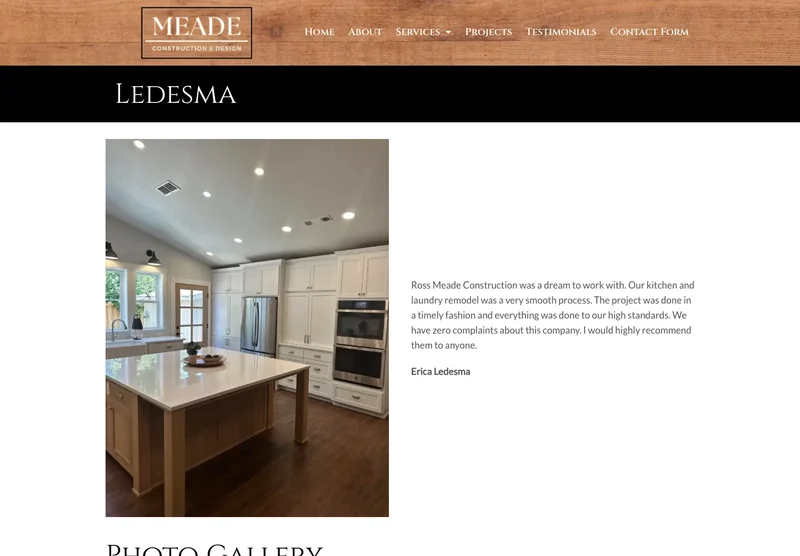
2. Clear Purpose
Why does your website exist? What do you want it to achieve, and what do you want visitors to do? Answer those questions before the design work starts.
A clear purpose guides every decision about your website’s layout, design, content and navigation, and it gives you a way to measure whether the site is working.
To define your website’s purpose:
- Identify your target audience and their needs, goals, challenges, and preferences
- Decide what makes your business the right choice and how you solve your customers’ problems
- Set specific, measurable goals for the website, such as calls or quote requests per month
- Align your website’s purpose with your overall business strategy and vision
3. Functional and User-Friendly
An effective website is easy to use. User experience (UX) is how people feel while they use your site, and it covers everything from speed and layout to accessibility.
A user-friendly website works on every device and browser, loads fast, has working links, clear navigation and a consistent design, and is accessible to everyone.
To make your website functional and user-friendly:
- Use a responsive design, part of our web design services, so the layout adapts to every screen size
- Keep the site fast by compressing images, trimming code and using caching
- Test your website’s functionality on various devices and browsers using tools such as BrowserStack or LambdaTest
- Build with current web standards such as HTML5 and CSS3
- Follow web accessibility guidelines
- Ask real customers for feedback with a short survey or form
4. Simple and Attractive Design
A good-looking website doesn’t need to be flashy. A simple design often works best: a clear visual order, strong contrast, tidy alignment, and colors, fonts, images and white space chosen with care.
To create a simple, attractive design:
- Use a grid-based layout to keep your content aligned and organized
- Choose colors that match your brand and set the right mood
- Use typography that is legible, readable, and consistent
- Use images that are relevant, high-quality, and optimized
- Use icons that are simple, recognizable, and consistent
- Use white space to create breathing room and focus attention
What Fast Looks Like on a Phone
These are Google PageSpeed Insights results for two websites we built. Russco Enterprises is an excavation company in Douglas County. Oregon RV Outlet is an RV dealership in Grants Pass with a photo-heavy inventory.
Russco Enterprises · Mobile
Google PageSpeed Insights, August 2, 2026
Oregon RV Outlet · Mobile
Google PageSpeed Insights, September 11, 2026
Individual homepage laboratory tests; scores can change between runs. Both sites scored 100 for desktop performance. See the Russco project · See the Oregon RV Outlet project
5. Easy Navigation
Navigation is how people move around your website and find what they came for. It affects how long they stay and whether they become customers. Good navigation is clear, predictable and consistent, and it gets people where they are going quickly.
To make navigation easy:
- Use descriptive and concise labels for your menu items
- Use a hierarchical structure that reflects your website’s content and purpose
- Use breadcrumbs to show users where they are and how they can go back
- Use a search function to help users find specific information
- Use a sticky or fixed navigation bar that stays visible as users scroll
- Use a hamburger menu or a collapsible menu for mobile devices
6. Fast-Loading
Speed shapes the whole experience. A fast website delivers its content in under three seconds. A slow one frustrates visitors, sends them back to the search results and can cost you rankings.
To build a fast-loading website:
- Optimize your images by resizing, cropping, compressing, and using the right format
- Minify your code by removing unnecessary spaces, comments, or characters
- Use caching techniques to store frequently used data on the user’s browser or server
- Use a content delivery network (CDN) to distribute your content across multiple servers around the world
- Use tools such as Google PageSpeed Insights or GTmetrix to measure and improve your website’s speed
7. Mobile-Ready
A mobile-ready website is designed for phones and tablets first, because most people now visit websites on their phones. It adapts to every screen size, has buttons big enough to tap, loads quickly, and includes phone-friendly features such as tap-to-call and directions.
To make your website mobile-ready:
- Use a responsive web design approach that adapts your website’s layout and content to different screen sizes and resolutions
- Use media queries to apply different styles based on device characteristics
- Use viewport meta tags to control how your website is displayed on different devices
- Use touch-friendly elements such as buttons or links that are large enough and spaced enough
- Add tap-to-call and map directions for visitors on the go
Putting It All Together
Quality content, a clear purpose, easy use, a simple design, clear navigation, speed and a phone-friendly layout give your website a solid foundation. SEO, marketing and analytics build on top of it. If you would like help getting the foundation right, call or text me at (541) 226-8087.

I run Good Creations in Grants Pass. I work directly with business owners on website design, content, and search. My work includes service writing, inventory websites, and custom publishing tools.
Meet Bob