
Question: What should a small business website homepage include?
Answer: A small business homepage should have a clear headline that says what you do, a short summary of your services and who you serve, a strong call to action, easy-to-find contact options, testimonials and other trust elements, fast loading, and a phone-friendly layout with simple navigation to your key pages.
The 3-Second Rule
Your homepage is often the first and only page visitors see. It is your shop front, reception desk and best salesperson rolled into one. In the first three seconds, a visitor needs to know who you are, what you do, and what to do next.
When that information is right in front of them, they stay.
Plenty of small business sites bury the call to action or struggle on phones, and those visitors head back to Google and click a competitor. Here is a practical checklist for a homepage that keeps them.
Meade Construction Shows the Work Before the First Meeting
Ross and Emily Meade build custom homes. Their website puts each finished project in its own gallery with the homeowner’s review, so a prospective client can see the quality of the work before they call.
Screenshots captured September 17, 2026.
The portfolio does the selling
Every finished home becomes a page a future client can browse before the first meeting.
See the Meade Construction & Design project →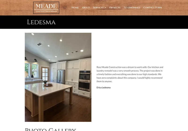
1. The Problem-Solving Headline
The most common mistake I see is a homepage that opens with “Welcome to [Company Name]” or a vague slogan like “Excellence in Service.” The visitor learns nothing from it.
Your headline should speak directly to the problem the visitor came to solve.
Weak: “Quality Solutions for You.” Strong: “Industrial maintenance that keeps your line running.”
The strong version tells the visitor exactly what you do and what they get. At Good Creations we write these headlines with owners, using the words their customers use.
2. The “Who We Serve” Summary
Right below the headline, give a short summary of your services and who you serve. Visitors scan more than they read.
Use short bullet points or sections named with the terms customers search for. If you are a plumber in Medford, say “Emergency Plumbing” and “Medford and the Rogue Valley” near the top of the page.
That helps Google understand what you do and where, and it tells the visitor they are in the right place.
Want help summarizing your business on your homepage? Call me at (541) 226-8087 and we’ll talk through how to organize your services.
3. The Primary Call to Action at the Top
This is the most important item on the checklist. Put one primary call to action on the screen before the visitor scrolls, in the area known as “above the fold.”
Specific buttons like “Call Now” or “Request a Quote” get tapped far more than a generic “Contact Us.”
Repeat the call to action further down the page as a reminder. When visitors can find your phone number instantly, more of them call. We plan call-to-action placement into every homepage we design, so the next step is always clear.
What Fast Looks Like on a Phone
These are Google PageSpeed Insights results for two websites we built. Russco Enterprises is an excavation company in Douglas County. Oregon RV Outlet is an RV dealership in Grants Pass with a photo-heavy inventory.
Russco Enterprises · Mobile
Google PageSpeed Insights, August 2, 2026
Oregon RV Outlet · Mobile
Google PageSpeed Insights, September 11, 2026
Individual homepage laboratory tests; scores can change between runs. Both sites scored 100 for desktop performance. See the Russco project · See the Oregon RV Outlet project
4. Immediate Trust Elements
Why should a stranger choose you? Your homepage should answer that within seconds.
Trust elements include:
- Testimonials. Short quotes from happy clients.
- Logos and badges. Associations, certifications or well-known clients.
- Real photos. Your actual team, trucks and work.
Reviews that mention specifics, such as “they arrived on time” or “exceeded my expectations,” are some of the strongest trust builders. Good Creations helps you gather and present them, and real photos make your business instantly recognizable.
5. Usability, Speed and Mobile Layout
A homepage has to be easy to use as well as good-looking.
It should load quickly, as I covered in the slow website article, and it should work well on a phone.
On a phone, visitors should be able to read everything without zooming or scrolling sideways. The menu sits behind a simple icon, and the phone number is a tap-to-call button. Good Creations designs mobile-first, so your homepage works as well as it looks.
6. Clear Navigation Paths
Your homepage directs traffic. It sends each visitor to the information they need.
Keep your menu simple and descriptive, with standard labels like “Services,” “About,” “Projects” and “Contact.”
Links within the homepage should lead visitors to those inside pages, so they always know where to click for more detail. Our standard build includes 5 to 7 core pages, each connected from the homepage.
How Does Your Homepage Stack Up?
Compare your current homepage with this checklist:
- Does your headline solve a problem?
- Is your phone number clickable?
- Are there real testimonials visible?
- Does it load fast on your phone?
Fixing individual pieces helps, and a redesign makes everything work together.
If you found gaps, your homepage is ready for an upgrade built around this checklist.
Call me at (541) 226-8087 to talk about turning your homepage into your best source of leads.

I run Good Creations in Grants Pass. I work directly with business owners on website design, content, and search. My work includes service writing, inventory websites, and custom publishing tools.
Meet Bob