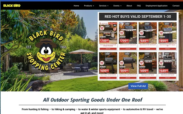
Think about walking into a shop you’ve never been in before. If the lights are flickering, the signs are confusing and you can’t find anyone to talk to, do you calmly browse for 10 minutes, or do you turn around and leave? Your website works the same way. People arrive with no context, no loyalty and no patience, and they are asking one question: “Is this real, and is it for me?”
Here’s a quick self-test I use with business owners in Medford, Grants Pass and across the Rogue Valley. Open your homepage on your phone, hold it at arm’s length, and give yourself 5 seconds. Then ask: “Would I feel comfortable calling this business right now?” If the answer is “I’m not sure,” that uncertainty is often why your calls and form fills are lower than they should be.
Make the Top of the Page Clear and Easy to Contact
The top of your homepage, the part visitors see before they scroll, is your credibility checkpoint. I want your visitor to understand three things immediately: who you help, what result you deliver, and what to do next. That means a clear headline, a supporting line that explains the result, and one primary call to action that stands out.
Here’s what that can sound like. A chiropractor in Central Point could use the headline “Chiropractic care for back pain and sports injuries in Jackson County,” then a supporting line: “Same-week appointments, clear treatment plans, and insurance-friendly billing.” The call to action might be “Schedule an Appointment.” Clarity creates trust because visitors know right away they are in the right place.
Next, make your business details easy to spot: your phone number, your service area, and the basics that show you are a real business. If you serve Ashland, Talent and Phoenix, say that. If you’re a contractor in Josephine County, put it in plain language. Show your full business name next to your logo, and make the Contact link obvious. Someone who wants to call you should find your number in a second.
Have a question about the trust signals on your website? Call me at (541) 226-8087 or send me an email.
Meade Construction Shows the Work Before the First Meeting
Ross and Emily Meade build custom homes. Their website puts each finished project in its own gallery with the homeowner’s review, so a prospective client can see the quality of the work before they call.
Screenshots captured September 17, 2026.
The portfolio does the selling
Every finished home becomes a page a future client can browse before the first meeting.
See the Meade Construction & Design project →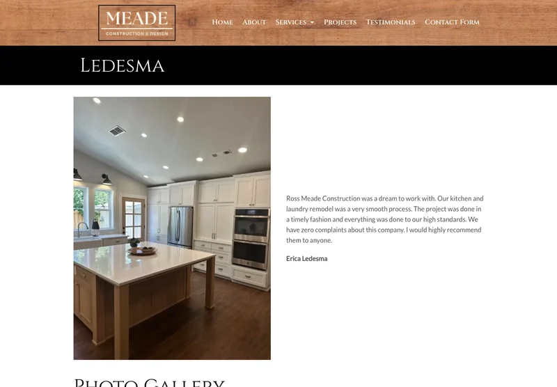
Use Polished Visuals That Say “Real Business”
People say, “I care about quality,” and what they often mean is, “I want to be sure I’m in good hands.” Visual cues help visitors feel they are dealing with an established business. I’ve seen businesses with great services lose leads because their site looked inconsistent or unfinished.
Consistency is the big one. Use typography that matches across headings, paragraphs, buttons, and forms. Keep spacing clean so sections don’t feel cramped. Choose a cohesive color palette that feels intentional. These are small details, but they signal professionalism the same way a clean storefront and clear signage do.
Photos matter more than most people realize. A high-quality photo of your team, your office, your work truck or a real job site in the Rogue Valley builds trust faster than any stock photo. Generic hero images, mismatched icons and template layouts tell visitors “this could be anyone,” and uncertain visitors hesitate. Hesitation costs you calls.
Put Proof Near Your First Call to Action
Proof turns “This looks nice” into “I trust them.” A visitor who has never heard of you wants to know that other people chose you and were happy with the result. That’s why I treat proof as part of how a website brings in leads.
Near your first call to action, add proof that makes choosing you feel safe. A short review with a name is strong. A testimonial with a photo is even stronger. If you have measurable results, use them. “Helped 200 homeowners in Jackson County last year” or “Average response time under 9 minutes during business hours” gives the visitor something concrete to believe.
Badges work well when they are recognizable and relevant: licenses, association memberships, insurance and clear guarantees. Placement is the key. Put a small set of your strongest proof near the first call to action, and deeper proof lower on the page. Full testimonials, longer case studies and before-and-after stories are valuable, and they usually get read after the visitor has decided the business is credible.
Build Technical Trust with Speed and Security
Technical trust is the quiet kind. Visitors may not know what HTTPS is, but they notice when the browser warns that a site isn’t secure. They notice when a form feels sketchy, and when a page takes so long to load that they’re staring at a blank phone screen.
So the basics matter. HTTPS should be active across the entire site. Forms should be secure and tested regularly. I’ve seen businesses lose leads for weeks because a form stopped sending notifications and nobody noticed. That’s like a phone line that rings on the customer’s end and never on yours.
Speed matters just as much. If your site takes more than a few seconds to load on a phone, the first impression is already slipping. People read slow as outdated, and outdated as risky. Small details add up too: broken links, a copyright year that says 2019, missing page titles. Each one makes a business feel neglected, and together they cost you calls.
What Fast Looks Like on a Phone
These are Google PageSpeed Insights results for two websites we built. Russco Enterprises is an excavation company in Douglas County. Oregon RV Outlet is an RV dealership in Grants Pass with a photo-heavy inventory.
Russco Enterprises · Mobile
Google PageSpeed Insights, August 2, 2026
Oregon RV Outlet · Mobile
Google PageSpeed Insights, September 11, 2026
Individual homepage laboratory tests; scores can change between runs. Both sites scored 100 for desktop performance. See the Russco project · See the Oregon RV Outlet project
Build Confidence with Clear Copy and Navigation
I call these the silent trust killers, because they rarely look like obvious errors. The most common is generic copy. Phrases like “quality service” and “we care about our customers” appear on every competitor’s site, so they tell the visitor nothing. Specific details about your work build trust instead.
Confusing navigation is another. If your menu has eight items, three dropdowns and labels that don’t match what people expect, visitors feel lost, and lost visitors leave. Pop-ups can backfire too, especially on phones. A discount offer, an email signup and a chat widget covering the screen all at once feels desperate.
Hard-to-find contact information is one of the fastest ways to lose a ready-to-buy customer. If someone in Eagle Point wants to call you, your number should be right in front of them, big enough to read and tap. Give mobile layouts special attention: misaligned sections, overlapping text and tiny buttons make a business feel risky.
Run a 10-minute homepage trust checklist
You can run a practical trust check in about 10 minutes, and I recommend doing it every quarter. Start on your phone, because that’s where most local traffic comes from. Load your homepage and hold off on scrolling. In the first 5 seconds, can you answer: What do you do? Who do you help? Where are you, or what areas do you serve? What should I do next?
Now look for proof near the top. Do you have at least one review, badge or credential near the first call to action? Is your phone number visible and tappable? Are your buttons big enough to tap easily? Then switch to a desktop and repeat. A site can look fine on a desktop and fall apart on a phone, and that’s where trust gets lost.
As you note what’s missing, fix whatever makes contacting you harder first. Clarity comes first, then proof, then one obvious next step. Trying to fix everything at once gets you stuck. Fix the message at the top, add proof near the call to action, and make contact effortless, and inquiries usually go up with no change to your ad spend.
Build Trust Into the Website from the Start
This is why I treat a website as a trust system. A well-planned small business website builds credibility by design, starting with messaging that makes it clear who you help and what result you deliver. It supports that message with a mobile-first layout, consistent visuals, and proof placed where people make their decision.
When I build a small business website, it comes with these trust signals built in: clear copy at the top of the page, a focused call to action, easy ways to get in touch, secure forms, and the technical basics that make your site feel stable. I also include basic SEO setup, such as page titles, descriptions and structure, because credibility depends on being findable and looking current.
If you’re not sure where your website is losing trust, I can help you find it quickly. Request a quick audit or schedule a discovery call, and I’ll point out the biggest trust gaps on your homepage, especially the ones costing you calls in the first 5 seconds. Then we can decide whether a few targeted fixes are enough, or whether it’s time for a site that earns trust the moment someone lands on it.

I run Good Creations in Grants Pass. I work directly with business owners on website design, content, and search. My work includes service writing, inventory websites, and custom publishing tools.
Meet Bob