Good design is less about where the search box goes and more about a handful of principles that shape every decision. Once you know them, you can build a site that communicates in a way your visitors understand.
One of the biggest questions in web design is, “How do people use websites?” The answer is simpler than you might think. Like shoppers in a store, visitors browse, click on whatever sparks their curiosity, and pass over everything else. Most are looking for something specific. If a page isn’t what they expected, they back up and keep looking.
We tend to think design makes or breaks a website, and content matters even more. People will overlook ads and small design flaws when the content is useful, which is why sites with great content attract steady traffic over time.
Remember that people scan web pages more than they read them. They look for headings and key points that tell them what the page is about.
Web visitors want answers quickly. When a website takes too long to give them what they need, they leave and look somewhere else.
People don’t always pick the best option online. Usually they pick the first one that looks good enough, because that’s faster than comparing every choice.
They also rarely read a website from top to bottom. They hop around the page, following their instincts and interests.
Meade Construction Shows the Work Before the First Meeting
Ross and Emily Meade build custom homes. Their website puts each finished project in its own gallery with the homeowner’s review, so a prospective client can see the quality of the work before they call.
Screenshots captured September 17, 2026.
The portfolio does the selling
Every finished home becomes a page a future client can browse before the first meeting.
See the Meade Construction & Design project →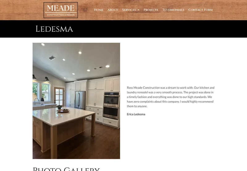
Visitors want to stay in control. They like to move around the website on their own terms, with the back button working the way they expect and new windows opening only when they choose.
- Make things obvious. Design your website so it is clear at a glance and answers visitors’ questions before they ask. That means a clear site structure, plain language, and important information that is easy to find.
- Respect people’s patience. If you want visitors to use your service, make it easy. The fewer steps it takes to try it, the more people will. Keep every process on your site short, simple and intuitive.
- Guide people’s attention. Some parts of a page naturally draw the eye. Use bold colors, large type, strong images or interactive elements to point visitors to the sections that matter most.
- Show off your features. Make your website’s features easy to see and easy to use, with a clear interface and helpful hints where needed.
- Write effectively. Match your writing to how your visitors browse. Stick to the point, use everyday words, and make your content easy to read and informative.
- Keep it simple. A simple design keeps attention on your content and makes the site easy to navigate.
- Use white space. Empty space gives the eye a rest and makes information easier to take in.
- Communicate clearly. An effective website delivers its message clearly and consistently, with a clear structure, consistent wording and a cohesive visual design.
- Follow conventions. Familiar design conventions make your site easier to use: navigation where people expect it, standard text layouts, and color schemes that feel familiar.
- Make it accessible. Everyone, whatever their abilities, should be able to use your website. Provide text alternatives for images, make sure the site works with a keyboard alone, and use clear, straightforward language. An accessible website reaches more people, and it is the right thing to do.
Effective web design balances looks, ease of use and content. It starts with understanding your audience and meeting their needs. Follow these ten rules and you’ll have a website that works for years. If you’d like help with yours, call or text me at (541) 226-8087.
What Fast Looks Like on a Phone
These are Google PageSpeed Insights results for two websites we built. Russco Enterprises is an excavation company in Douglas County. Oregon RV Outlet is an RV dealership in Grants Pass with a photo-heavy inventory.
Russco Enterprises · Mobile
Google PageSpeed Insights, August 2, 2026
Oregon RV Outlet · Mobile
Google PageSpeed Insights, September 11, 2026
Individual homepage laboratory tests; scores can change between runs. Both sites scored 100 for desktop performance. See the Russco project · See the Oregon RV Outlet project

I run Good Creations in Grants Pass. I work directly with business owners on website design, content, and search. My work includes service writing, inventory websites, and custom publishing tools.
Meet Bob